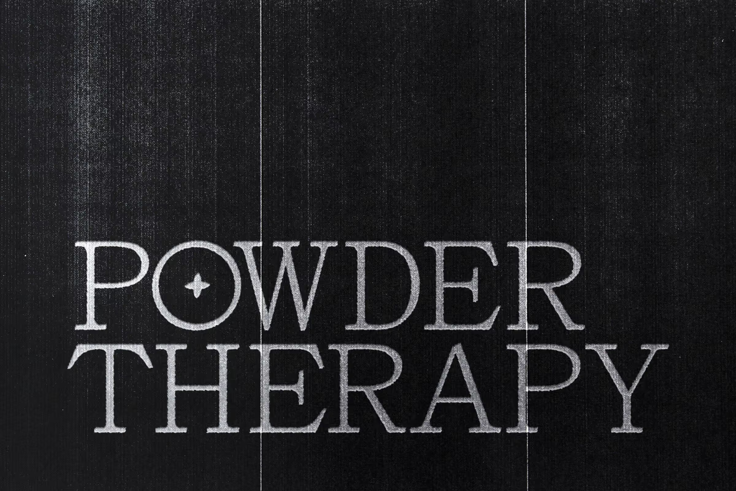
POWDER THERAPY
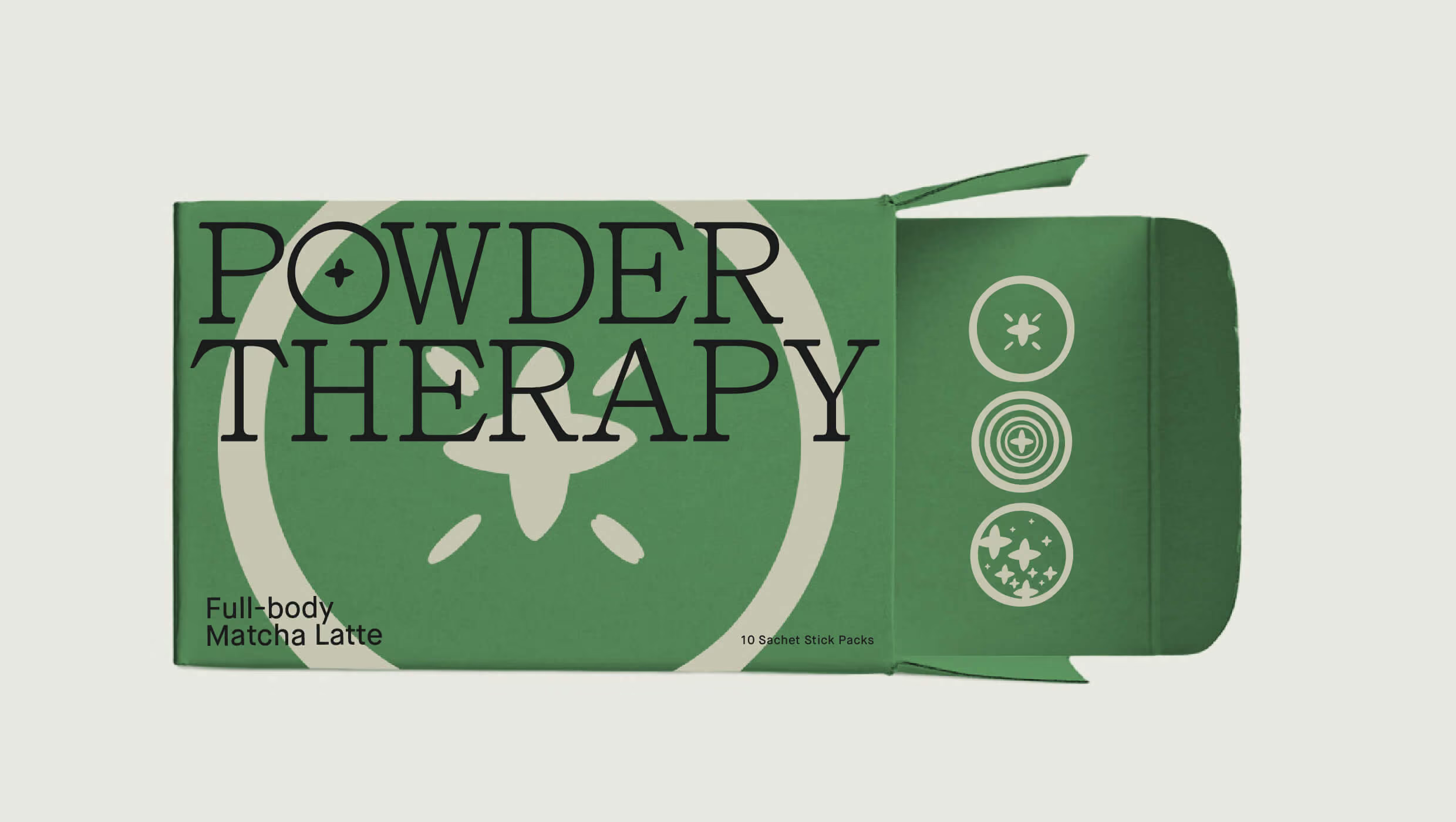
Powder Therapy treats an everyday matcha latte as a small act of care. The idea starts with the powder itself: fine particles, seen as stars. The star stands for the treatment and the hope it sparks. The mood stays calm and close to nature, with rows of tea, a single leaf, and a swim in green water.
Client: Powder Therapy
Project: Brand Identity & Packaging Design
Location: Canada
Time: 2020
Logo
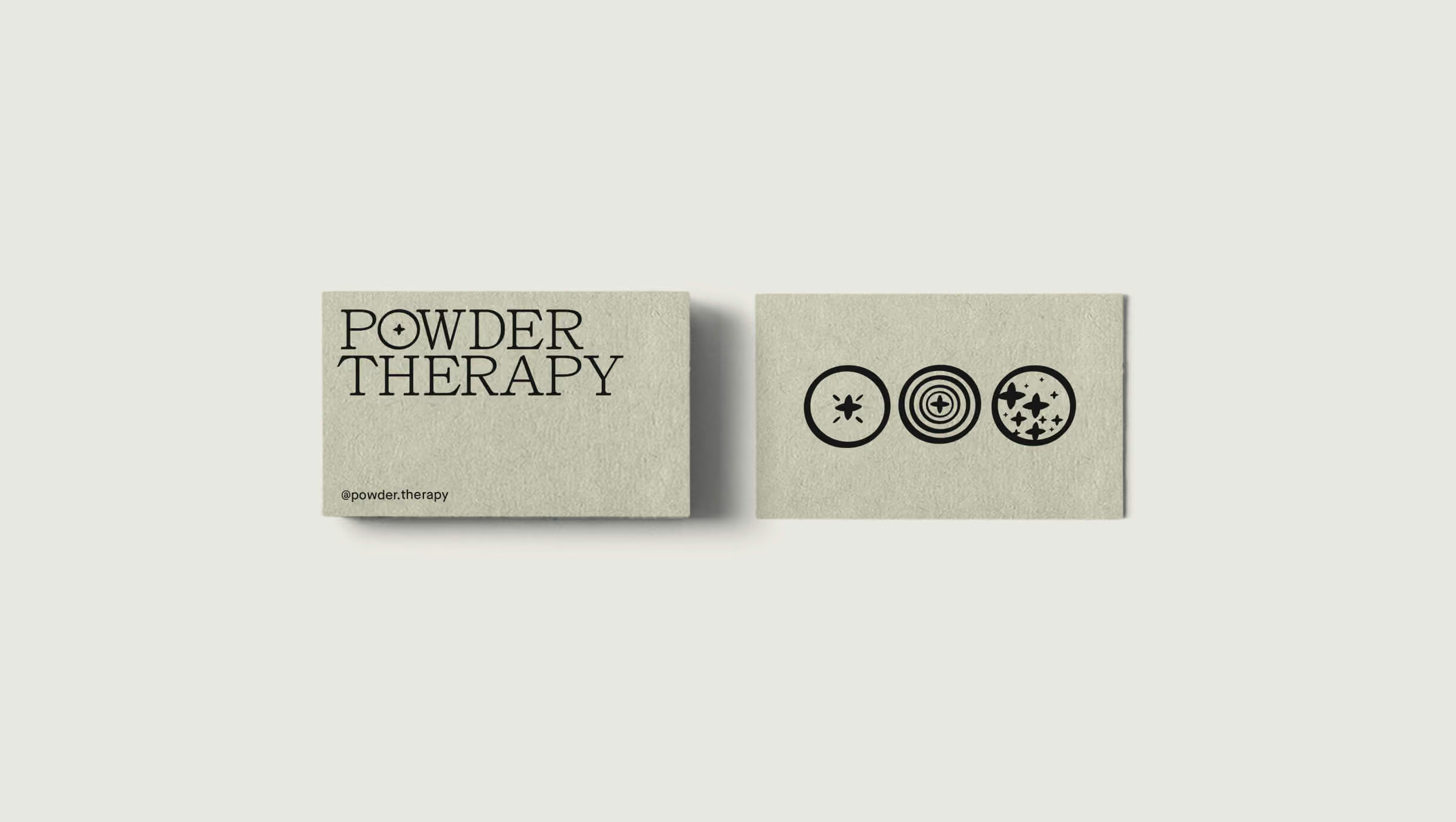
The symbol series comes from the letter O and the star. Fine Particle is that O drawn as a circle around one star, with ticks radiating from the star. Powder Therapy nests the star in concentric rings. Better and healthy life fills the circle with many stars.


Type
Maison Neue, from Milieu Grotesque, carries the voice. Built with a stronger focus on optical criteria, it pays attention to harmony, rhythm, and flow. Neutral by design, it helps the eye relax—the feeling the brand wants for its audience—whether set as a title or a paragraph.
Color
The palette is Light Gray, The Neon Green, and Black. Neon Green, a bright shade, stands for a focus on life and a balanced life. It signals determination toward goals—willpower, bravery, and attention.

Applications
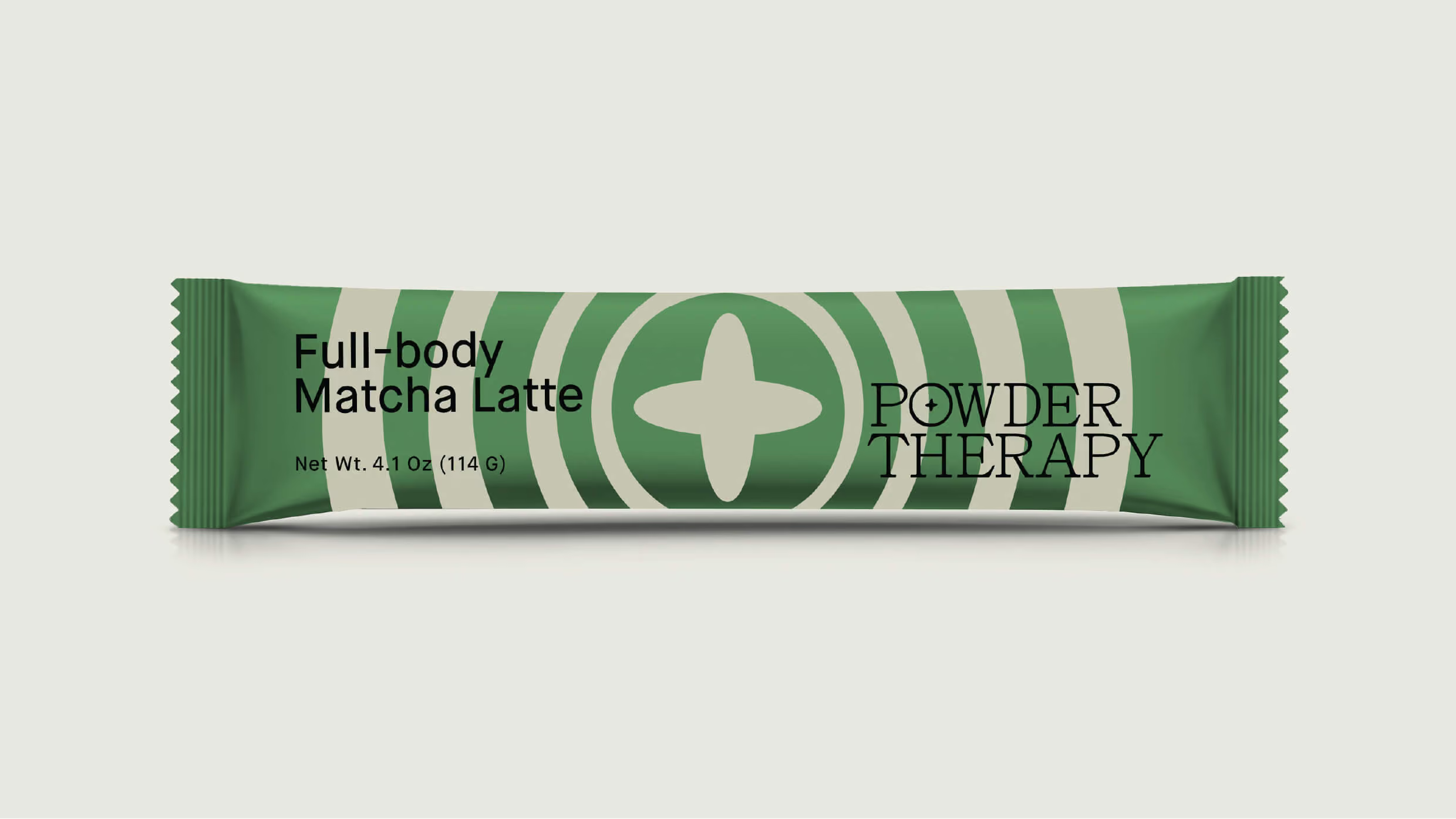
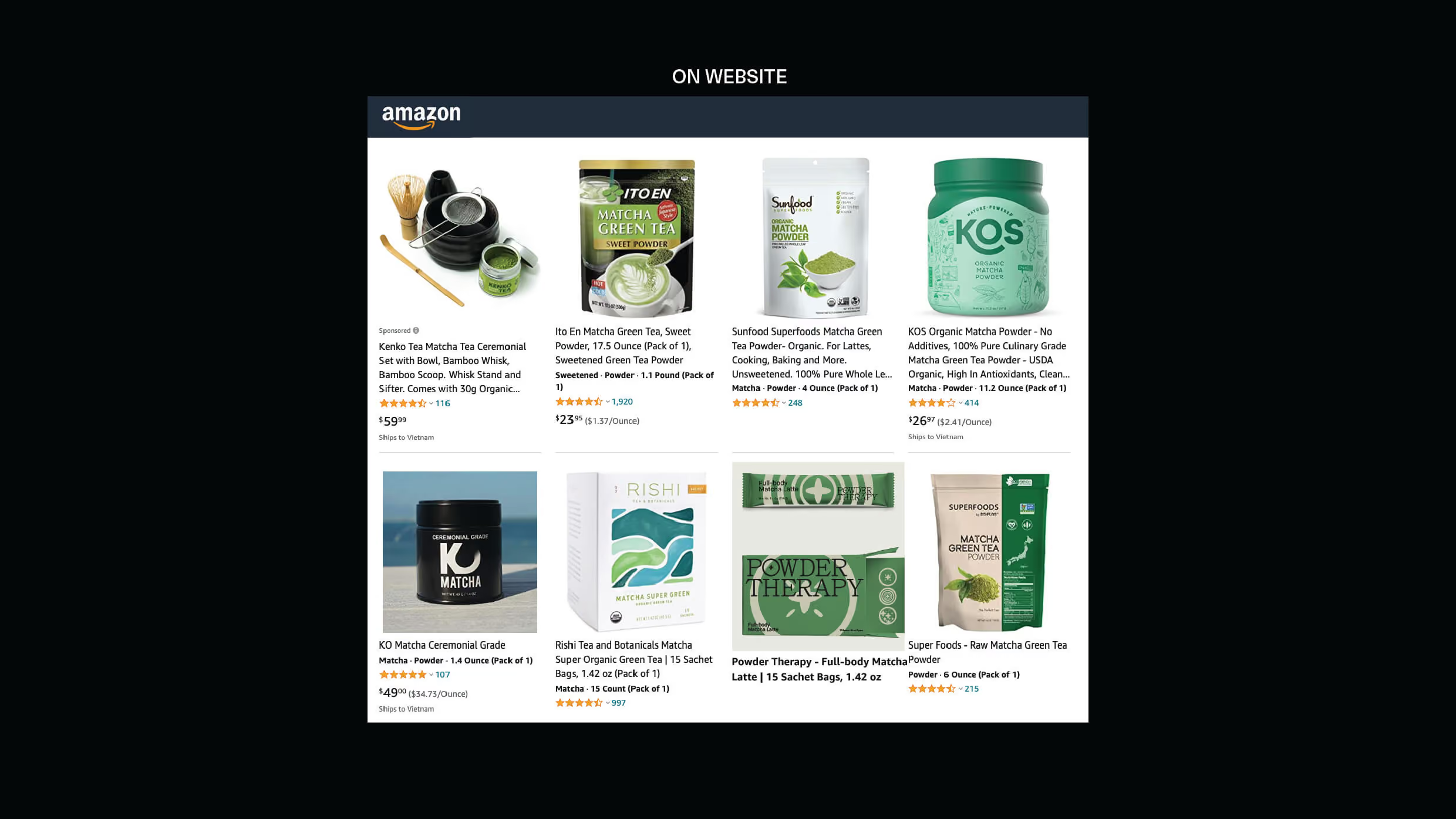
The system lands on Full-body Matcha Latte boxes of 10 sachet stick packs, single-serve sachets, cup sleeves, stickers, and business cards—one showing the Instagram handle @powder.therapy. Web and social carry the same line: an Amazon-style listing grid and an Instagram profile whose bio repeats the brand promise.